INSIDE THE BUILDING
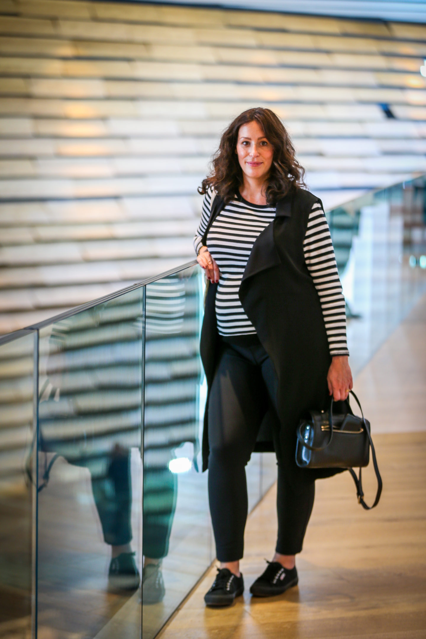
The first thing that struck me about the interior of V&A Dundee was the expanse of space. The enormity of the inside was astounding. I hadn’t expected it to look so spacious, given the narrowing base of the exterior of the building (where the entrance is), but I couldn’t have been more wrong.
The dark, Irish limestone-floored foyer leads to a small cafe and the shop, and even the staircase – which snakes up the side of the building in angular, giant steps – adds to the overwhelming size. It’s massive: long and wide, it makes your feet look tiny as they climb up, and up, and up, until you reach the upper level where the gallery and exhibitions spaces are housed.
The other aspect of the interior that hits you as you walk further in is the light. I was thankful to get inside after walking beneath a dark, stormy sky, battling the wind and praying the raindrops wouldn’t come to much more – despite the conditions, inside the V&A was incredibly bright, and there was a warm, golden glow created by the wooden slates on the walls that mirror the exterior design. A surprise, perhaps, because the outside is so rugged, dark and, as one review called it, primal.
Everyone I spoke to on the day, and in many reviews I’ve read, agree that the architect Kengo Kuma and his team have designed a complex building in which every line, every angle and every piece of the structure has been considered, creating a visual and emotional masterpiece that moves as you move. The result of a vision that intended the V&A to connect the River Tay and the city, it isn’t by accident that it looks how it does.
SCOTTISH DESIGN GALLERIES
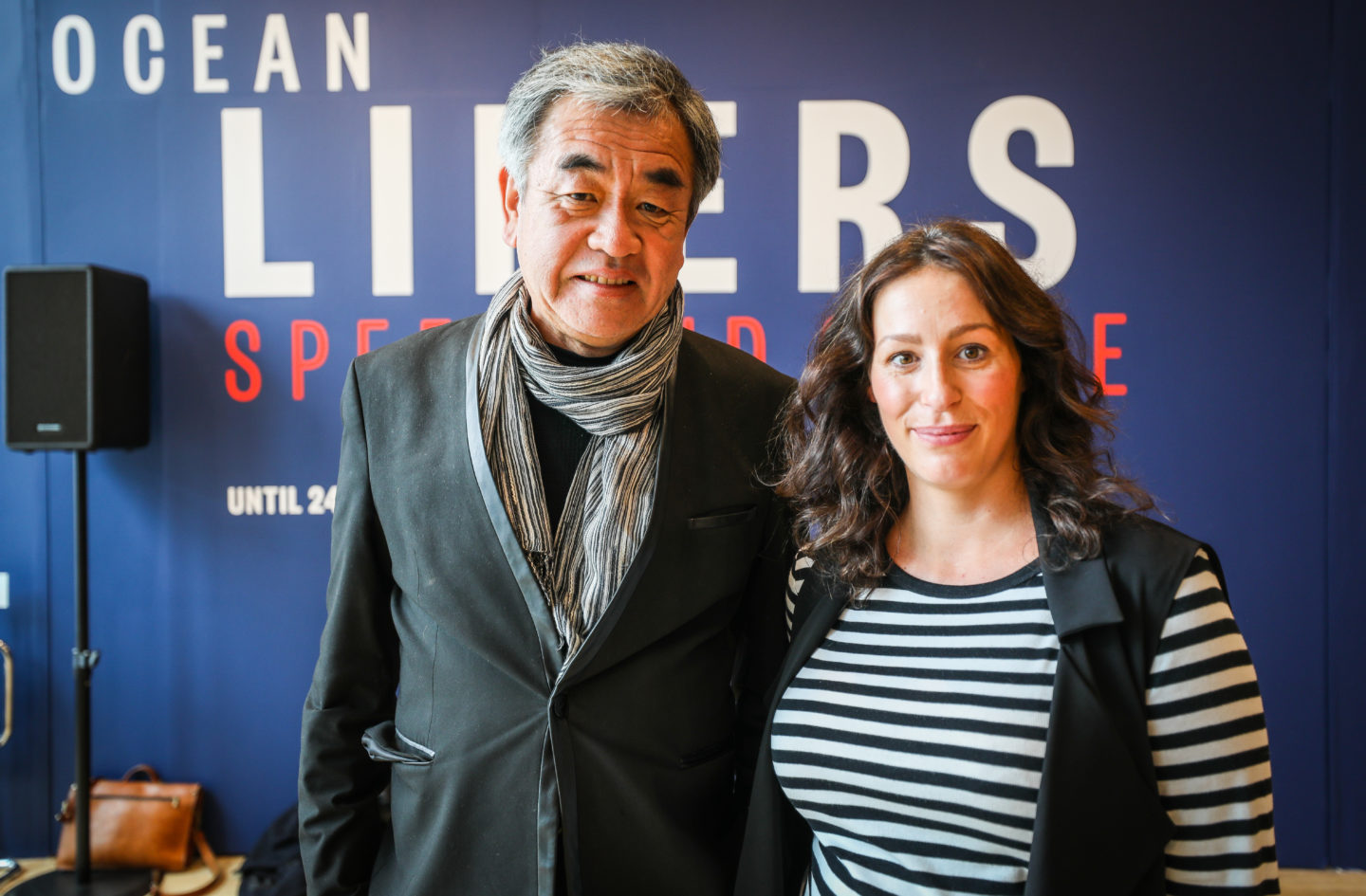
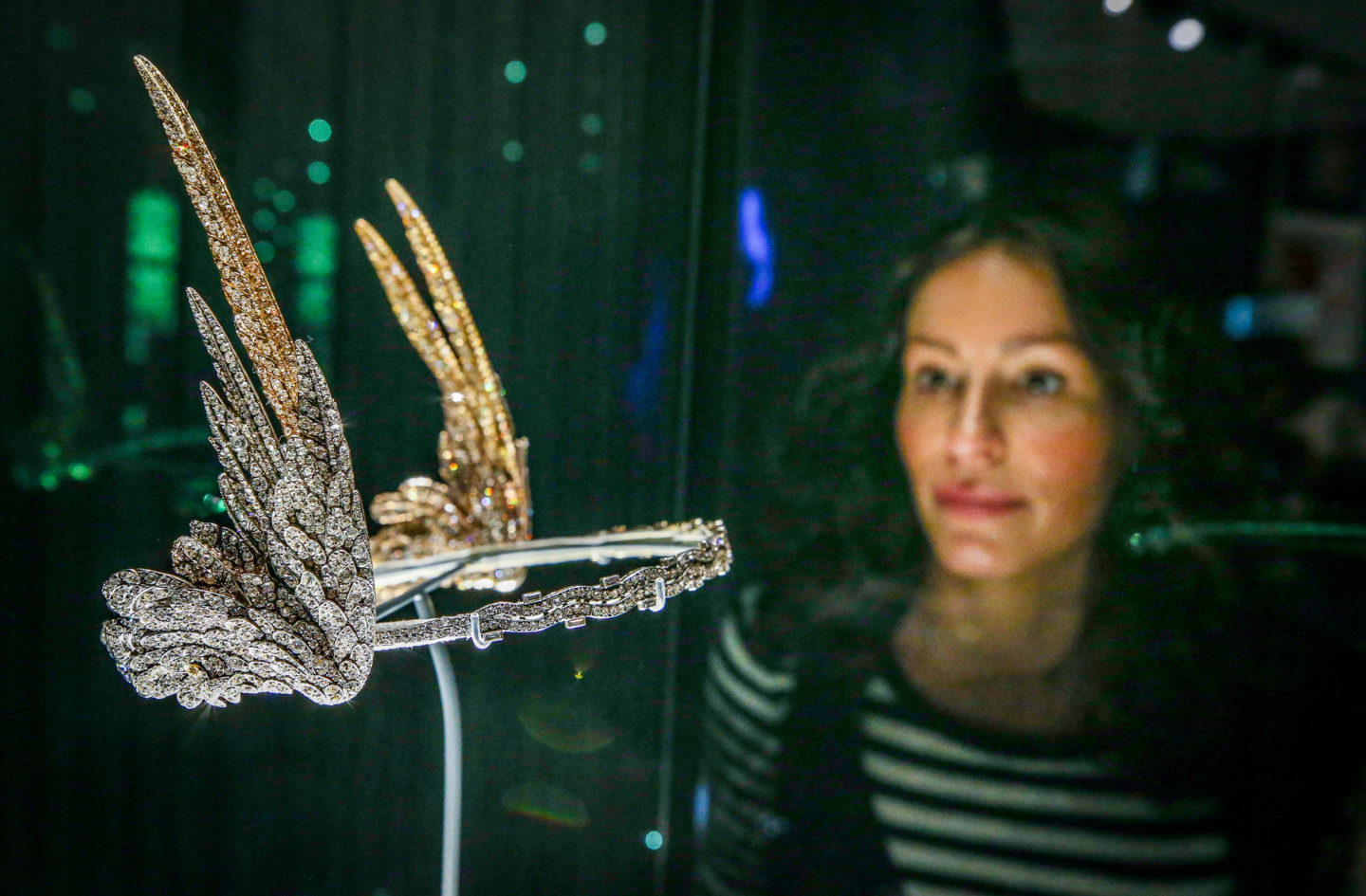
After we listened to speeches given by Philip Long (Director of V&A Dundee), Councillor John Alexander (Dundee City Council Leader), Tristram Hunt (Director of the V&A in London) and the star himself, Kengo Kuma (architect of V&A Dundee), we were free to explore. I first went into the Scottish Design Galleries and was surprised at how extensive the display pieces were. Yes, there are Scottish links to each but it isn’t just about that – it’s about the object itself and the variety of these keeps things interesting. For instance, I was excited by the fashion (a dress by Christopher Kane, a suit by Vivienne Westwood, a bridal gown by Alexander McQueen, a ski-ing outfit from 1968) but I was intrigued by rest too (the game ‘Lemmings’ being shown on a screen, a mahogany chest on loan from the Philadelphia Museum of Art, a Paisley wool imitation India shawl, a tapestry of a woman wearing a spotted dress). My favourite though was the McQueen projection against a curtain of chainmail (also favoured by my husband who has no interested in fashion) and the diamond-winged tiara commissioned by the late Mary Crewe-Milnes, Duchess of Roxburghe. There’s something for everyone, but that doesn’t mean it’s too varied, nor does it mean you’ll lose interest because it’s too niche. Somehow, they’ve got it just right.
Within the Scottish Design Galleries you’ll find Charles Rennie Mackintosh’s Oak Room, which was stored for around 50 years and now lives at V&A Dundee after being conserved and reassembled. It’s a dark room, obviously, and it’s curious in its lack of things – but as soon as I entered, the smell of oak hit me, which felt pretty intense in such a small and dark space. It would be easy to walk in and walk out, but stand for a minute or two and you’ll appreciate the beauty of the oak and subtle lighting.
THE EXHIBITION – OCEAN LINERS: SPEED & STYLE
Usually we’re excited by an exhibtion in its own right, becuase most museums are already in existence – it’s the exhibitions that attract us. It’s a shame that Ocean Liners loses its impact because of our anticipation of the V&A Dundee opening – existing, in fact. Before the opening, I had heard a lot of people say that they weren’t convinced about the choice of exhibition, but given Dundee’s maritime history I think it was the perfect exhibition to open with.
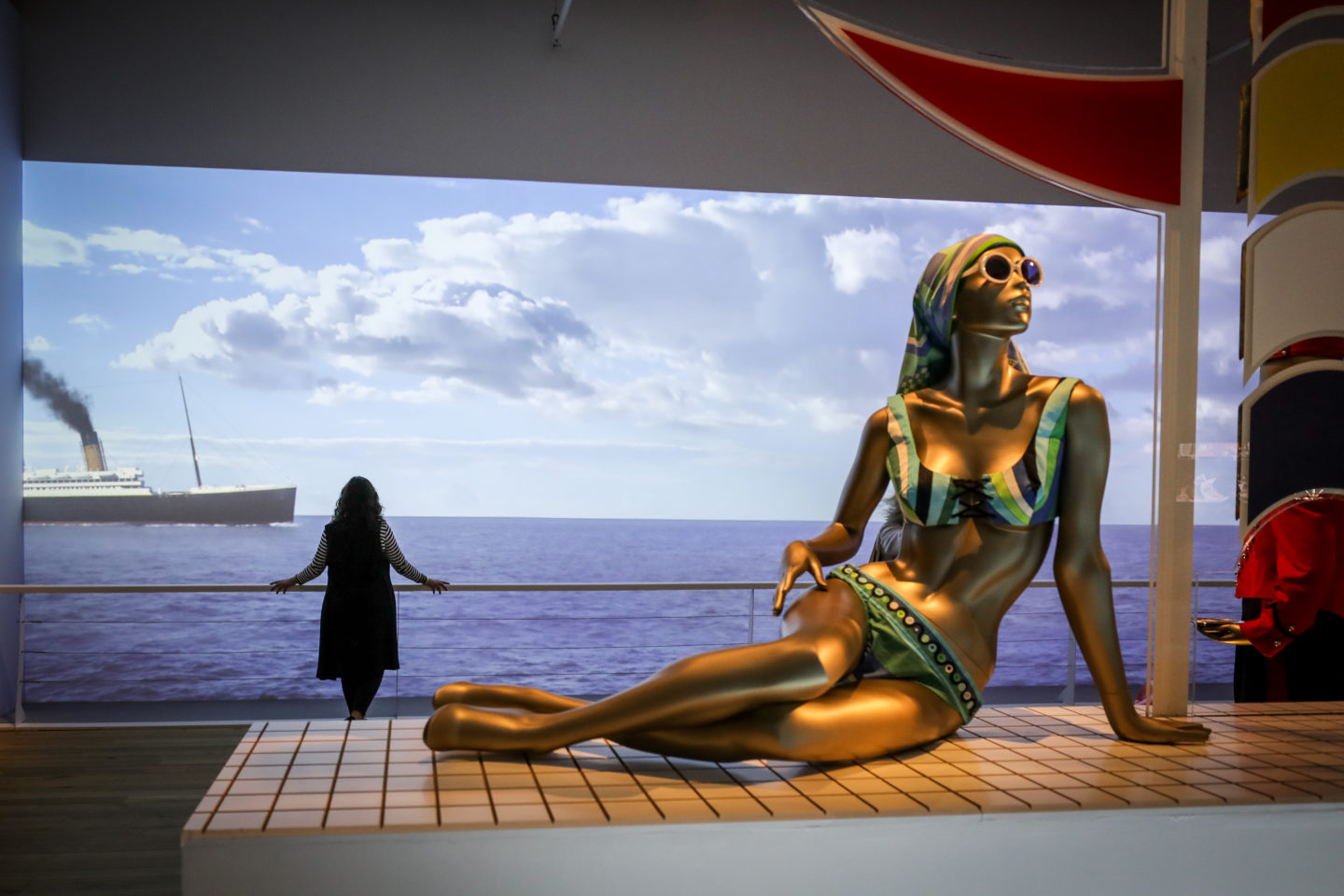
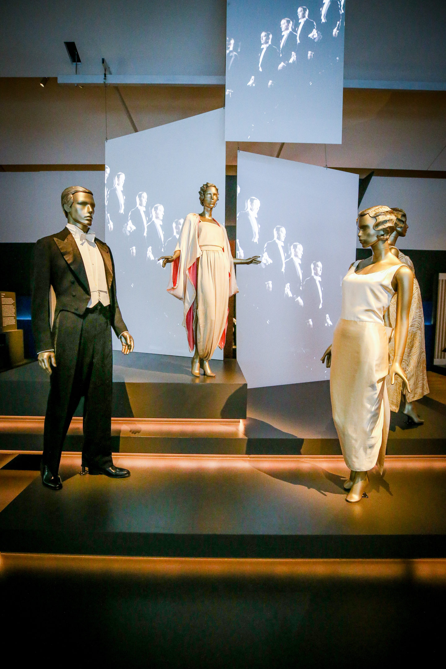
I wasn’t disappointed. Ocean Liners: Speed & Style covers everything about ocean liners, from the history, advertising and style to the engineering, war commissions and interior design. There’s a huge model ship as you enter, and a vintage poster wall. You’ll also find a couple of pieces from The Titanic (I mean, wow) as well as clothing worn by socialites including swimwear and a Dior suit as worn by Marlene Dietrich, and the most beautiful set of trunks by Goyard. But there’s more, such as engine models, framed pictures of ship builders in Glasgow, and stunning pieces of art and interiors from on board some of the most glamorous ships.
Ocean Liners: Speed & Style is fascinating and educational, and visually pleasing, and isn’t that how an exhibtion should be? It’s a lot of fun to visit, and does a grand job of demonstrating the sheer power of the ships as well as the romantic glamour of it all for the passengers. It was also the point of my visit when I realised the power of what we have in our city.
Lastly, we were treated to lunch in Tatha, the V&A’s restaurant. We enjoyed roast cauliflower flatbread, confit duck wings (oh my gosh, so good), East Coast pea hummus with melba toast, pork cheeks with peanuts and pak choi, and Perthshire smoked salmon royale. There was even beer by Brew 71 on offer.
On first sight, the restaurant is bright and the view is stunning – the sun had come out to glisten on the silvery Tay, and the Discovery stood proud next to its new neighbour. A terrace provides fresh air and a view through the dark exterior of the V&A. Inside, the bar is modern and fresh, the tables and chairs bland in comparison but undoubtedly left simple to allow the view to do all the talking. I would like to see a bit more interest when it comes to the decor, given that the V&A’s imagination should ‘spark and inspire the next generation’ – but it’s a minor, personal preference.
FINAL THOUGHT
I can safely say I’ve fallen head over heels in love with V&A Dundee. Not only for what it’s done and what it promises to do for our city, not only for it being a reminder of even the wildest of dreams coming true, but for its contrasting beauty, its potential, and lastly and mostly, for it having lived up to expectations. The hardest part is done – the rest is up to us.
With thanks to V&A Dundee for inviting me to their online press preview.
Images: Kris Miller.





Can’t wait, great descriptive writing.
Author 16th September 2018 / 23:31
Thank you. Let me know what you think – go asap! X
Great piece Christina. Can’t wait to visit
Author 16th September 2018 / 23:31
Can’t wait to hear what you think of it! X
I’m so excited to visit. Loved the article
Author 16th September 2018 / 23:31
Thank you! Let me know what you think xx